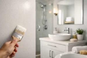
A rental unit can look freshly updated or immediately dated based on one decision: the wall color. The best paint colors for rentals do more than look attractive in a listing photo. They brighten rooms, work with changing furniture styles, hide everyday wear reasonably well, and make future touch-ups far less complicated.
For apartment managers, landlords, and owners preparing a home between tenants, the goal is not to choose the trendiest shade on a paint chip. It is to select a dependable color palette that helps the property feel clean, well maintained, and ready for the next resident without creating extra labor at every turnover.
What Makes a Rental Paint Color a Smart Choice?
A good rental color needs to perform in real life. It should appeal to a broad range of tenants, from someone furnishing their first apartment to a family moving into a larger home. It also needs to coordinate with floors, cabinets, countertops, and trim that may not be changing anytime soon.
Neutral does not have to mean plain white or dull beige. The strongest choices have enough undertone to feel intentional, yet remain flexible enough for different décor styles. They also respond well to Kansas light, which can shift dramatically from bright summer sun to overcast winter days.
Durability matters as much as color. A washable eggshell or satin finish is often practical for busy living areas, while kitchens, bathrooms, and hallways may benefit from a higher-sheen finish that stands up to routine cleaning. Flat paint can hide surface imperfections, but it is generally harder to clean and touch up consistently in high-traffic units.
7 Best Paint Colors for Rentals
1. Soft Warm White
A soft warm white is one of the safest options for rentals because it makes compact rooms feel larger and clean without looking stark. Unlike a bright, cool white, a warm white has a subtle cream, beige, or greige undertone that prevents the space from feeling clinical.
This color works especially well with wood-look flooring, warm cabinetry, and tan or brown countertops. It is also a strong choice for units with limited natural light. Avoid whites that are too yellow, however. They can make older ceilings or trim appear dingy by comparison.
2. Light Greige
Greige, a balance of gray and beige, remains a reliable choice for rental interiors. A light greige gives walls more depth than white while staying neutral enough to pair with nearly any furniture, window treatment, or accent color a tenant brings in.
The key is choosing a greige with a balanced undertone. Some shades lean noticeably purple, pink, green, or blue once they cover an entire room. Testing a sample on several walls before committing helps avoid a surprise result, particularly in rooms with different exposures.
3. Pale Mushroom or Taupe
Pale mushroom and soft taupe shades offer a warmer alternative to gray. They create a comfortable, polished backdrop that works well in older homes, multifamily units with beige tile, and spaces with warm-toned carpet or cabinetry.
These colors can be forgiving of minor wall scuffs compared with bright white. They also add a little visual warmth without limiting a tenant’s decorating options. Choose a pale version rather than a deep brown-taupe, which can make smaller rooms feel closed in.
4. Muted Blue-Gray
For a rental that needs a little more personality, a muted blue-gray can be an excellent choice for a bedroom, bathroom, office, or single accent wall. The best versions are dusty and restrained, not bright or heavily saturated.
Blue-gray pairs naturally with white trim, brushed nickel hardware, and many modern flooring styles. It can make a basic room feel more finished in listing photos. The trade-off is that color matching after a repair can be more noticeable than with a traditional neutral, so keep clear records of the brand, finish, and exact color formula.
5. Soft Sage Green
Soft sage provides a calm, current look without becoming too specific to one design trend. It is particularly effective in bathrooms, laundry rooms, kitchens, and bedrooms where a small amount of color can make the space feel more welcoming.
A rental-friendly sage should be gray-based and understated. Strong olive or yellow-green shades may appeal to a narrower audience and can clash with existing finishes. When used thoughtfully, a soft sage can differentiate a unit from an all-beige competitor while remaining easy to live with.
6. Light Cool Gray
A light cool gray can still work well when the property has modern finishes, bright natural light, white cabinets, or cooler-toned flooring. It offers a crisp, contemporary appearance and can make white trim look sharp.
This option requires more care than it once did. In a dark room, cool gray can read blue and feel uninviting. It may also conflict with warm beige tile or honey-colored cabinets. If the existing fixed finishes are warm, choose a warm gray or greige instead of forcing a cool palette into the space.
7. Deep Charcoal for Select Areas
Charcoal is not a whole-unit wall color for most rentals, but it can be a practical and attractive choice in the right location. Consider it for an exterior front door, a small powder room, built-in shelving, or a well-lit accent wall in a higher-end unit.
Dark colors create contrast and can hide marks better than pale shades, but they show dust, require more careful cutting-in, and often need additional coats for even coverage. They are best used as a controlled design feature rather than a default choice for every room.
Choose Colors Around What Will Stay
Before selecting paint, look at the elements that are not being replaced: flooring, cabinets, countertops, tile, brick, and trim. Paint is flexible, but those fixed finishes set the direction. A cool gray wall beside warm tan tile can make both surfaces look less appealing, while a soft warm white may bring the entire room together.
For properties with multiple units, consistency is usually worth more than frequent experimentation. A standard wall color, trim color, ceiling color, and finish specification can simplify ordering, reduce leftover material confusion, and help maintenance teams complete touch-ups quickly. That does not mean every unit must feel identical, but it does mean the core palette should be intentional.
Keep a simple paint record for each property. Include the manufacturer, color name, formula if available, sheen, room or surface, and date used. A labeled sample board is even better. Small documentation steps prevent costly guesswork when a wall needs repair months later.
Paint Finish Matters as Much as the Color
The same color can look and perform differently depending on sheen. For walls in living rooms and bedrooms, eggshell is often the practical middle ground. It has a soft finish, cleans better than flat paint, and does not highlight every small wall imperfection.
Satin is frequently a better fit for kitchens, bathrooms, laundry rooms, hallways, and children’s areas because it handles moisture and cleaning well. Its light reflectivity can reveal uneven drywall repairs, though, so proper prep is essential. Semi-gloss is typically reserved for trim, doors, and cabinets, where a durable, wipeable finish is valuable.
A professional painting crew can help match the finish to the surface condition and the amount of traffic the space receives. At Royal Painting, that planning is part of delivering a clean, tenant-ready result rather than simply putting a new color on the wall.
Avoid These Common Rental Color Mistakes
The biggest mistake is selecting a color from a small chip without seeing it on the actual walls. Light direction, adjacent surfaces, and bulb temperature can change how a color reads. Apply samples in more than one area and view them in daylight and at night before making a final choice.
Another common issue is using too many colors. Multiple bold rooms may suit a personal residence, but they can make a rental feel fragmented and increase repainting work later. A consistent neutral throughout most of the unit, with one or two restrained accent opportunities, is often the more efficient choice.
Finally, do not paint over stains, smoke residue, water marks, peeling areas, or poorly patched drywall without proper preparation. Even the right color will not look professional if the surface underneath is not clean, sound, and properly primed.
A well-chosen rental color palette should make the next turnover easier, not create another decision to revisit. Start with the fixed finishes, test colors under the property’s actual lighting, and choose a durable finish that keeps the unit looking cared for long after move-in day.